Using Bayesian generalized linear model to compare mortality rates of smokers and non-smokers.
Bayesian
data science
R
Author
Miha Gazvoda
Published
January 9, 2022
Some time ago I watched Smoking: The Dataset a series of videos on calmcode.io. They show you how to analyze and compare 10-year mortality rates of smokers vs non-smokers. 1
In this post, I’ll use Bayesian inference together with a generalized linear model, to calculate the effect of being a smoker compared to the visual approach from calmcode. First, let’s see what they figured out.
Visual approach
Each row in the smoking dataset represents a person, whether she smokes and is still alive after ten years.
We also tweaked the dataset a bit and saved it to df. This will come in handy later on. From now on, we let’s focus on mortality instead of survival rates.
The most basic (and naive) approach would be just to calculate mortality rates per smoking status.
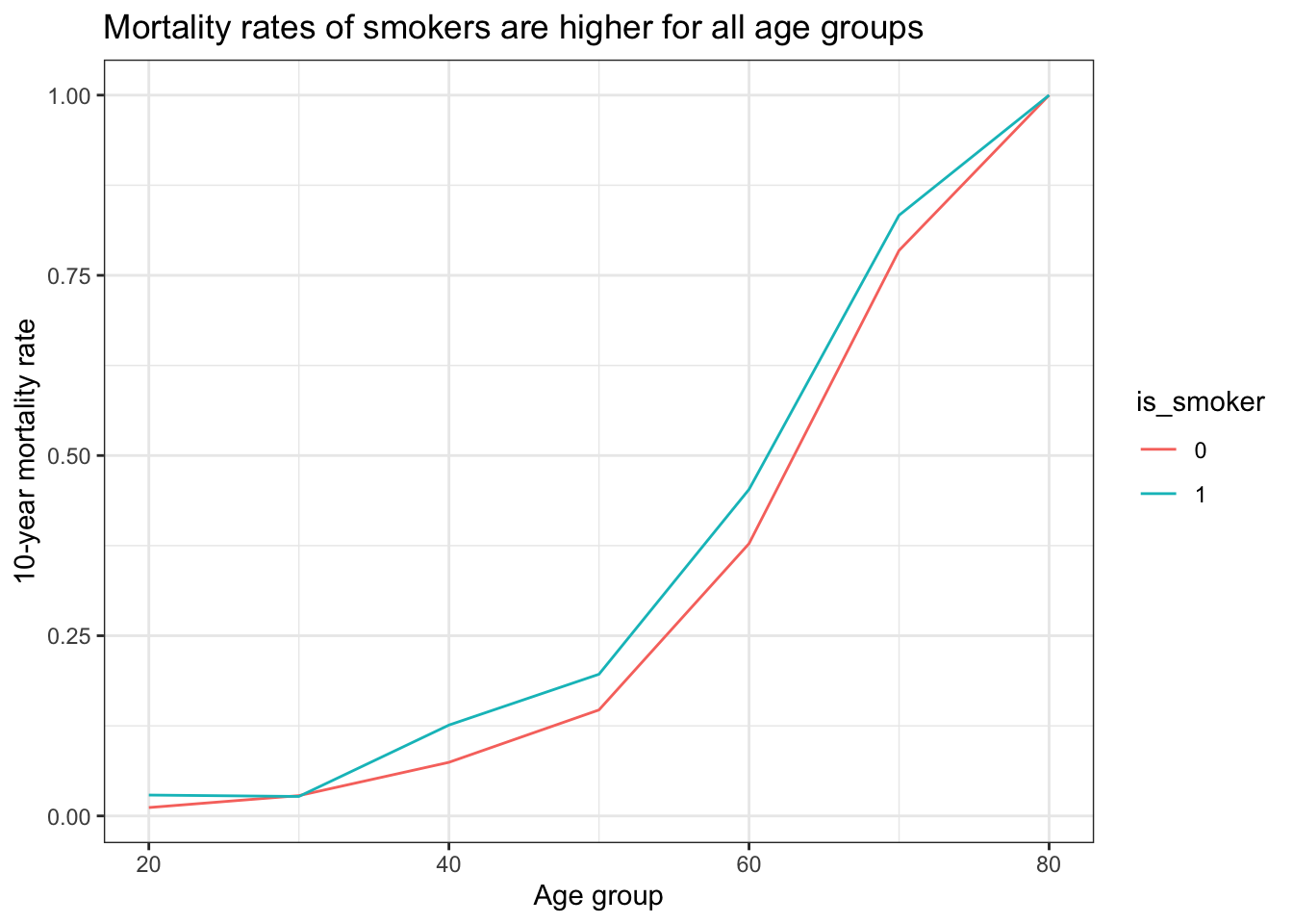
Surprisingly, it looks like smokers have lower mortality rates! However, we don’t “control” for age. Let’s compare mortality rates per age group:
df_agg <- df %>%mutate(round_age = plyr::round_any(age, 10)) %>%group_by(round_age, is_smoker =factor(is_smoker)) %>%summarise(death_rate =mean(is_dead), .groups ="drop")ggplot(df_agg, aes(round_age, death_rate, color = is_smoker)) +geom_line() +labs(title ="Mortality rates of smokers are higher for all age groups",y ="10-year mortality rate",x ="Age group" )
This shows a completely different picture! Smokers have higher mortality rates across all age groups. Before, we got different aggregated results because of different age proportions between smokers and non-smokers represented in the dataset. That’s known as Simpson’s paradox.
Calmcode videos stop at this conclusion, but I was wondered how to estimate the difference more precisely, without binning the ages? Bayes plus logistic regression to the rescue.
Bayesian approach
We’ll use a generalized linear model with binomial likelihood. When - as in our case - the data is organized into single-trial cases (whether the person died in the next 10 years), the common name for this model is logistic regression. We’ll use logit link (qlogis in R) to model the relationship between age and mortality rate. This transformation is necessary in order to take care that all p values map from [0,1] to [- \infty, \infty].
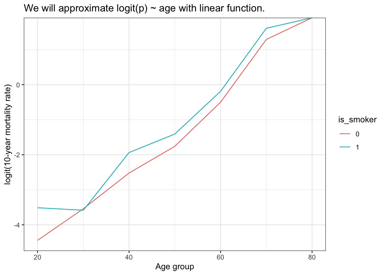
So, here’s how logit(p) ~ age looks on a plot:
ggplot(df_agg, aes(round_age, qlogis(death_rate), color = is_smoker)) +geom_line() +labs(title ="We will approximate logit(p) ~ age with linear function.", y ="logit(10-year mortality rate)", x ="Age group" )
By eyeballing the plot, it looks like we can model logit(death_rate) as a linear function: an intercept (mortality at some age) plus a slope (how mortality changes with age). It also seems that the slope is the same for both groups, but the intercept is different.
From this, we can construct a list of formulas for our model and run it:
formula <-bf(is_dead ~ is_smoker +I(age -60))priors <-c(# Intercept for non-smokers at age 60prior(normal(-0.3, 0.2), class ="Intercept"),# Additive effect for smokers at age 60prior(normal(0, 0.4), class ="b", coef ="is_smoker"),# Slope for age (shared between groups)prior(normal(0.1, 0.05), class ="b", coef ="IageM60"))# Fit the modelm <-brm(formula = formula,family =bernoulli(),prior = priors,data = df,sample_prior =TRUE,refresh =0)
The model formula is_dead ~ is_smoker + I(age - 60) uses logistic regression with three parameters:
An intercept representing mortality at age 60 for non-smokers
A coefficient for smoking status showing how much higher/lower mortality is for smokers (constant across ages on logit scale)
A shared slope term capturing how mortality changes with age
I centered age at 60 years because it’s more intuitive to think about mortality rates at a meaningful age, and the model would make less sense at very young ages where mortality rates are near zero.
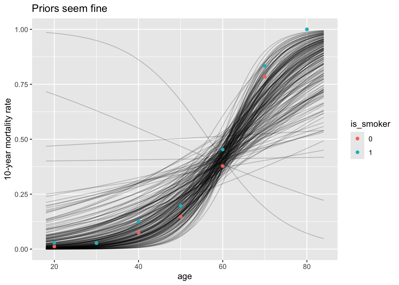
Before looking at the model, let’s double-check the priors:
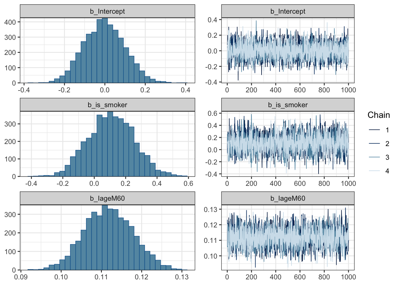
Priors seem fine - informative enough but also flexible. Trace plots of chains also look good!
Take a look at trace plots.
plot(m)
Here’s the summary of the model:
summary(m)
 Family: bernoulli
  Links: mu = logit
Formula: is_dead ~ is_smoker + I(age - 60)
   Data: df (Number of observations: 1314)
  Draws: 4 chains, each with iter = 2000; warmup = 1000; thin = 1;
         total post-warmup draws = 4000

Regression Coefficients:
          Estimate Est.Error l-95% CI u-95% CI Rhat Bulk_ESS Tail_ESS
Intercept    -0.00      0.10    -0.19     0.19 1.00     3479     3190
is_smoker     0.11      0.15    -0.17     0.39 1.00     2823     2332
IageM60       0.11      0.01     0.10     0.12 1.00     2940     2844

Draws were sampled using sampling(NUTS). For each parameter, Bulk_ESS
and Tail_ESS are effective sample size measures, and Rhat is the potential
scale reduction factor on split chains (at convergence, Rhat = 1).
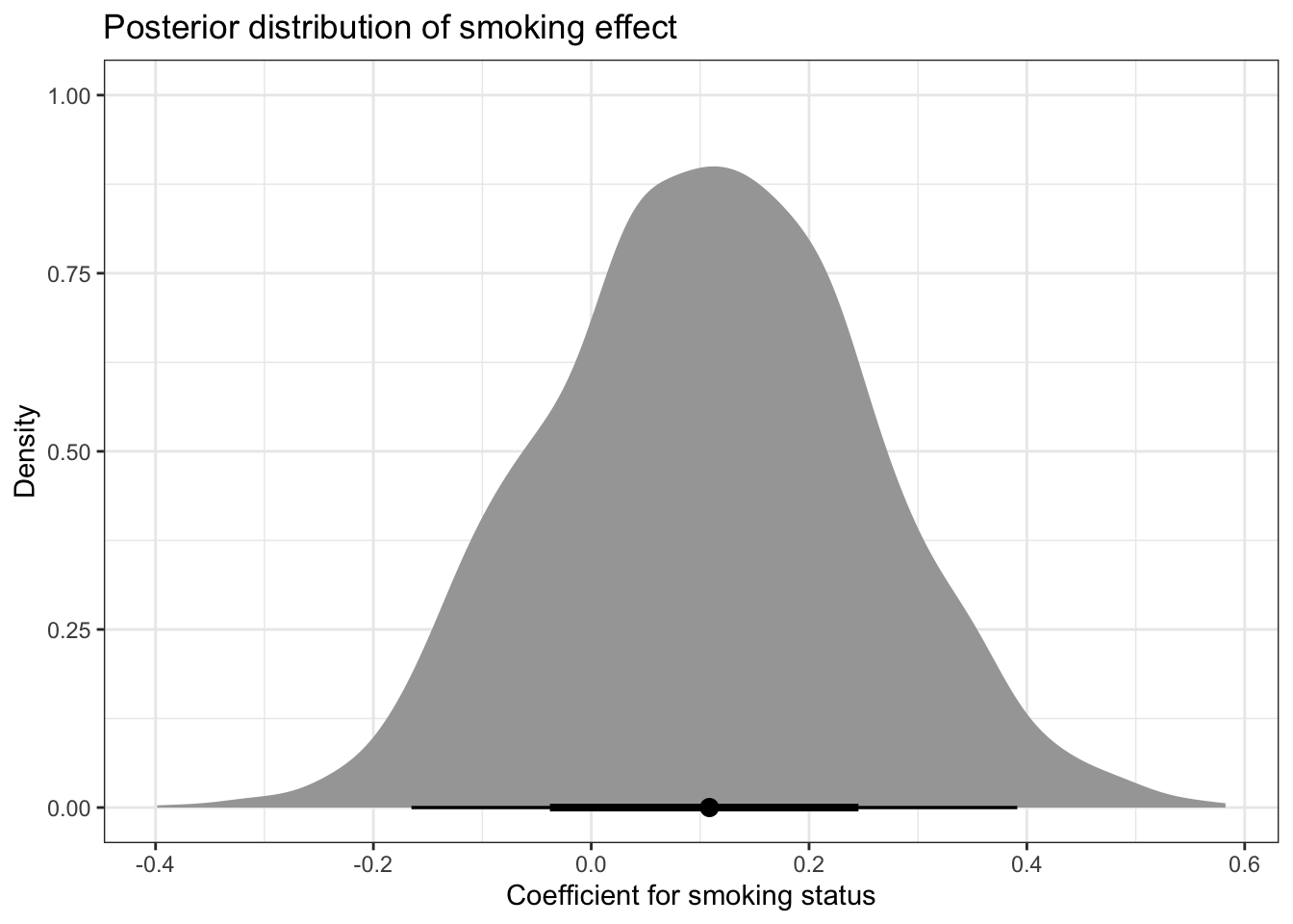
We can see that the is_smoker coefficient is positive, showing that smokers have higher mortality rate. We can plot the whole posterior distribution:
posterior_draws <-as_draws_df(m)posterior_draws|>ggplot(aes(x = b_is_smoker)) +stat_halfeye() +labs(title ="Posterior distribution of smoking effect",x ="Coefficient for smoking status",y ="Density" )
These distributions are based on the posterior samples. With them, we can also calculate the probability that non-smokers have lower mortality rate:
mean(posterior_draws$b_is_smoker >0)
[1] 0.768
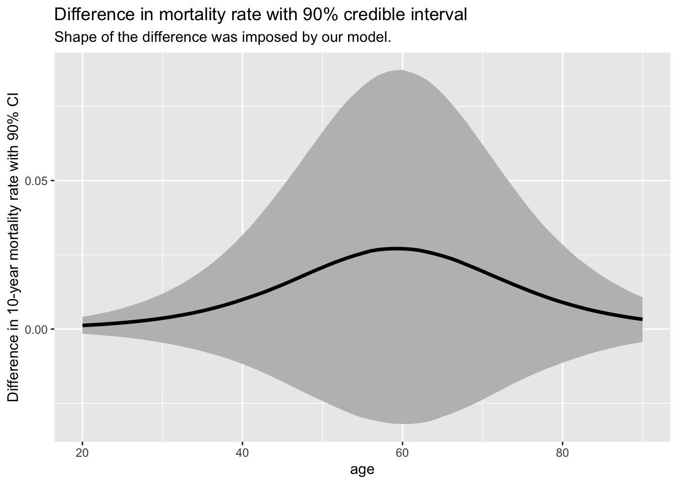
There’s around 77% chance that smokers have a higher mortality rate. We can also visualize how the difference in mortality rate is changing with age (note that the shape of the difference was defined by our model - but not the magnitude):
newdata <- tidyr::crossing(age =20:90, is_smoker =unique(df$is_smoker))mortality_predictions <-add_epred_draws(m, newdata = newdata, value ="p") mortality_predictions %>%group_by(age, .draw) %>%summarise(p_diff = p[is_smoker ==1] - p[is_smoker ==0], .groups ="drop") %>%ggplot(aes(x = age)) +stat_lineribbon(aes(y = p_diff), .width =0.9, fill ="gray") +labs(title ="Difference in mortality rate with 90% credible interval" ,subtitle ="Shape of the difference was imposed by our model.",y ="Difference in 10-year mortality rate with 90% CI" )
There seems to be up to ~3% mean increase (90% credible intervals range roughly between 10% and -2.5%) in the 10-year mortality rate for around age 60 which shrinks for younger and older. This might make sense:
for younger, the effects of smoking are not as big yet (and they have way smaller mortality rates anyway);
older people are more likely to die even without smoking.
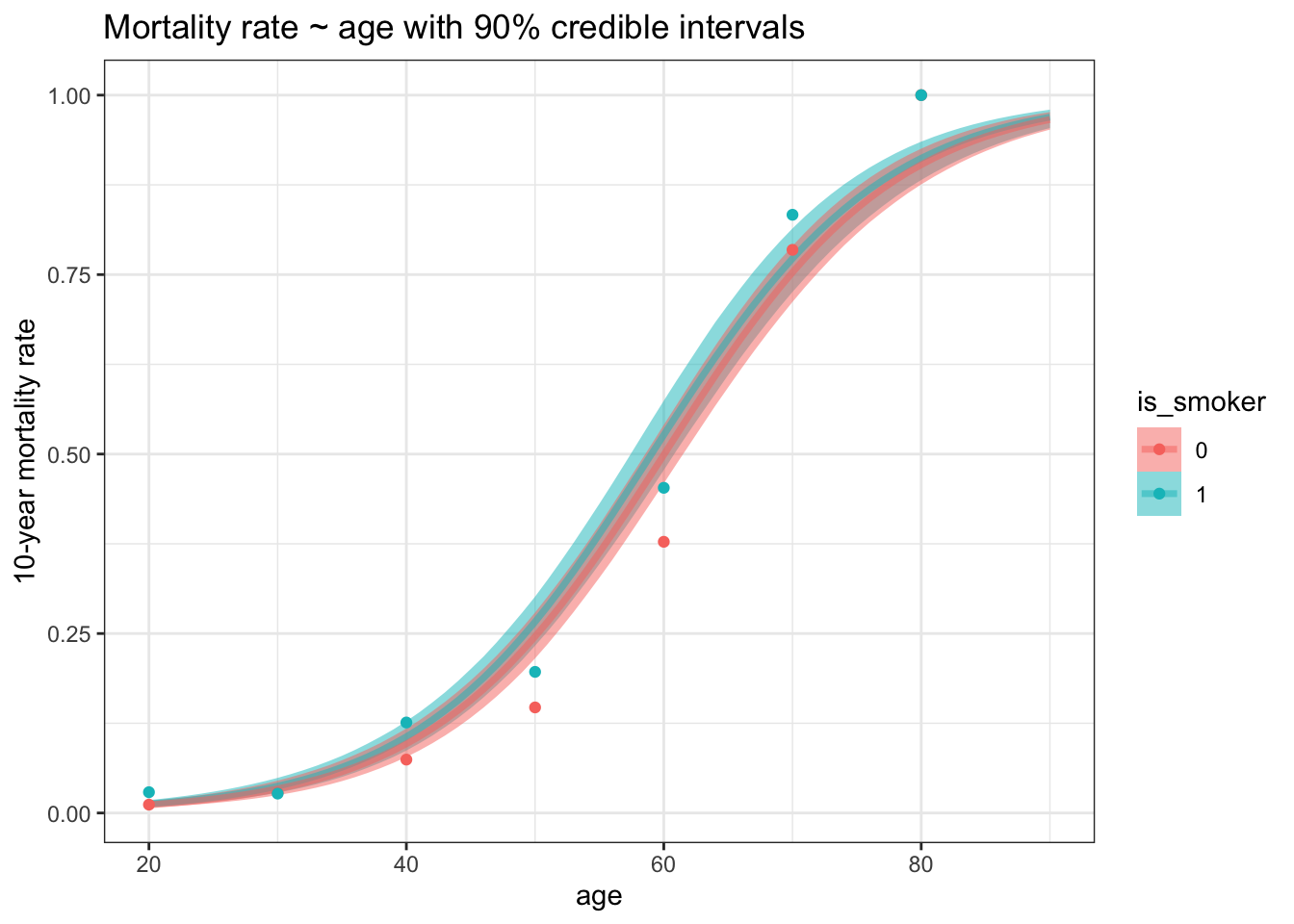
Here’s the full model-predicted mortality curve for both groups:
mortality_predictions %>%mutate(is_smoker =factor(is_smoker)) |>ggplot(aes(x = age, color = is_smoker, fill = is_smoker)) +stat_lineribbon(aes(y = p), .width =0.9, alpha =0.5) +geom_point(data = df_agg, aes(x = round_age, y = death_rate)) +labs(title ="Mortality rate ~ age with 90% credible intervals",y ="10-year mortality rate" )
So… don’t smoke. And use smokin’ Bayes.
Footnotes
Beware, not the effect of smoking - but being a smoker - because lifestyles of people who smoke from those who don’t differ in other aspects besides smoking.↩︎