
For the last few months I’ve been interested in the attention economy, how modern technologies hijack our minds to make more profit. I also wrote a ten-page article on the topic as a part of my faculty subject’s grade. During the research, I came across the movement called Time Well Spent which wants to “transform the race for attention so it aligns with our best interests”. Their website also offers apps which help you save time instead of wasting it. One of them is Moment.
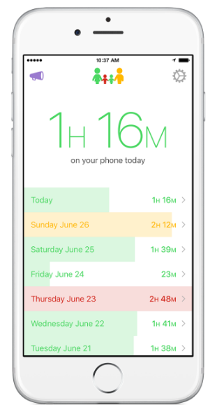
Moment app
Moment is an app that automatically tracks and helps you manage time spent on the mobile phone. The free version of Moment displays the duration of your mobile usage per day. The paid version helps you fight and limit use. There is also a family version.
It has the option to export GPS location (latitude and longitude), date, time, and duration of sessions. I used this data to make an analysis presented in the following paragraphs.
Overview
I started using Moment in the early days of December and forgot about it until recently. Of course, the app was working on its own. The graph below presents my mobile use per day and location. I calculated the location as weighted average of latitudes and longitudes. Let me remind you that you can click on the image or hyperlinks below the graphs for interactive plots.
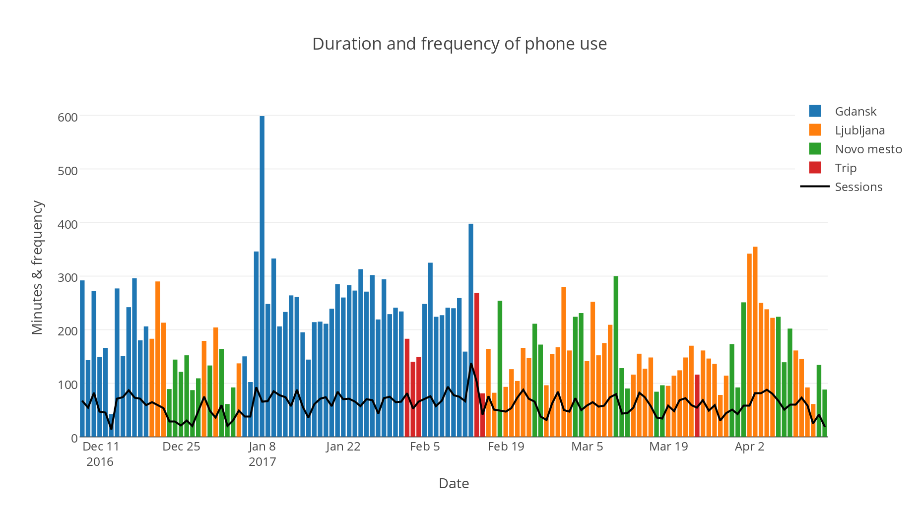
A recent study showed that young adults use their phones for a little more than 5 hours and check it 85 times per day on average. Let’s compare this to my results. I’ve been using it on average for 3 hours and 10 minutes and checked it 60 times each day. And I still have a feeling that I’m wasting my time on it…
Average day
That’s how my average day, expressed in probabilities of me being on the phone for each minute, looks like.
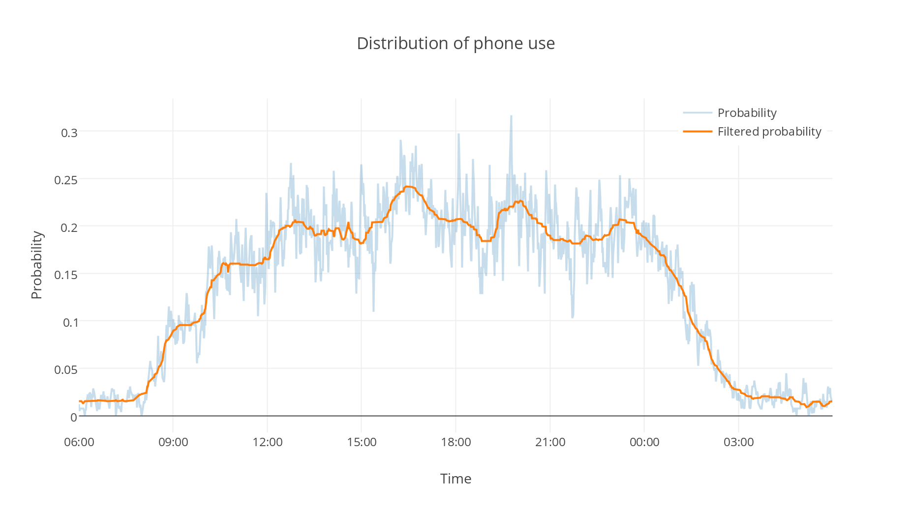
Probabilities over every minute are really noisy, so I applied the median filter to reduce noise. Unfortunately, because of my ‘free’ lifestyle (remember, I was on Erasmus exchange), you can’t learn a lot from the plot.
Average session
It’s time to take a closer look at the sessions — their durations — and compare them with the results of the previously mentioned study.
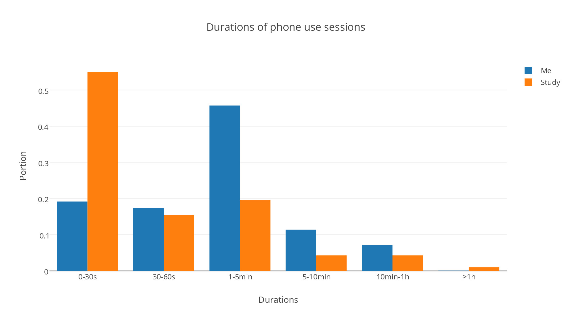
My median session is 95 seconds long. Theirs, less than half a minute. I assume that’s due to the two reasons: * I usually turn off the mobile data or wifi. Consequently, every time I want to check something online I have to turn it on again and that takes some time. * I mostly don’t use push notifications. That takes additional time when I want to check social media notifications — especially if I get hooked in the never-ending news feed.
Favorite locations
You can be gain a lot more than just phone usage from your mobile data. For example, favorite locations (for using my phone). I limited those to Gdansk and decided to cluster them to make top seven. Markers area is proportional to the time spent on the mobile phone on the exact location.
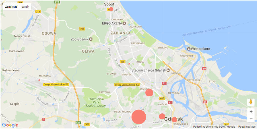 My top 7 places (for using phone) in Gdansk.
Biggest marker (93 hours) represents my home during the exchange. The dot above it, my university. Marker on the right, beautiful old town. Sopot, a place for parties…
Coding and writing
I wanted to keep this post as short and as interesting as possible— without going too much into detail (the article is meant for the general public). Let numbers and graphs speak for themselves. The initial plan also included t-tests to compare use with and without specific social media apps and distribution for my waking time. In the end, for the reasons mentioned above, I decided to leave them out.
I implemented the code in Python programming language using Jupyter Notebook. For data visualization (excluding the map), I used plotly.